After nearly thirty years of serving youth in need, we are thrilled to announce that the StandUp for Kids brand had a makeover!
Youth-Centered
Our new logo captures the awesome potential of young lives when they know care, feel loved, and have the support they need to move quickly from surviving to thriving. Youth are the heart of our organization, so it was important to convey that. The logo is youth-centered, energetic, and a clever evolution of our former look.
Proud to be the Purple People
Purple often represents wisdom or creativity. To the youth we serve, it represents safety, care, and support. Our kids often call volunteers the Purple People. Youth know they can trust them to get necessary assistance for survival. This recognition made it imperative that we keep purple as our primary brand color and keep our Purple People visible in the community.
More than a Tagline
“One life at a time” is more than just a tagline, it is how we approach our mission to end the cycle of youth homelessness. Each youth is given individual care and attention to begin a path toward success, and we support these journeys, step by step, one life at a time.
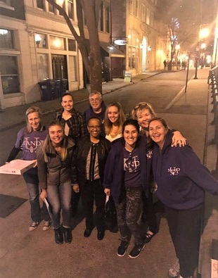
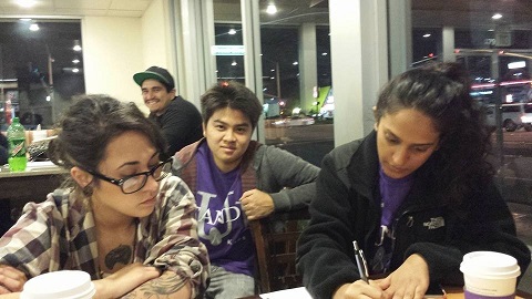
We could not do the work we do without staff and volunteers who are serve on the front lines, advocating for youth in our communities. We also couldn’t do it without supporters like you.
We truly hope our new brand speaks to you the same way that it has to us.
Press Release
For Immediate Release. Contact Justine Palmore, justines@standupforkids.org
STANDUP FOR KIDS REVEALS NEW BRAND IDENTITY WITH REDESIGNED LOGO
Decatur, GA – July 25, 2019 – StandUp for Kids, a national leader in providing critical services to homeless and at-risk youth, announced today the launch of its new brand identity and redesigned logo. This change comes as the organization prepares to celebrate thirty years of serving youth.
“We agreed that what was essential to our identity with youth was our name and the color purple,” said Eddy Ameen, Co-Chair of the Board at StandUp for Kids. “We arrived at a modern, energetic, and heartful icon, a more youth-centered font, a clean style template, and a tagline that perfectly captures the way we go about our mission: One life at a time.”
Working with the Dalton Agency based in Atlanta, GA, the StandUp for Kids logo has been carefully crafted to work effortlessly across digital and physical channels. The look captures the awesome potential of young lives when they know care, feel loved, and have the support they need from our volunteers to move quickly from surviving to thriving. “We knew it was the right time to update our logo and look,” adds Ameen. “We hope that it speaks to you the same way that it has to us.”
About StandUp for Kids: StandUp for Kids empowers homeless and at-risk youth by providing a safe, supportive environment where they can attain the necessary skills to enable them to thrive. Visit StandUpforKids.org to get involved or follow us on Facebook @StandUpforKidsNational.